One outcome of the 2023 Scientific Python Developer Summit was the Scientific Python Development Guide, a comprehensive guide to modern Python package development, complete with a new project template supporting 10+ build backends and a WebAssembly-powered checker with checks linked to the guide. The guide covers topics like modern, compiled, and classic packaging, style checks, type checking, docs, task runners, CI, tests, and much more! There also are sections of tutorials, principles, and some common patterns.
This guide (along with cookie & repo-review) started in Scikit-HEP in 2020. During the summit, it was merged with the NSLS-II guidelines, which provided the basis for the principles section. I’d like to thank and acknowledge Dan Allan and Gregory Lee for working tirelessly during the summit to rework, rewrite, merge, and fix the guide, including writing most of the tutorials pages and first patterns page, and rewriting the environment page as a tutorial.
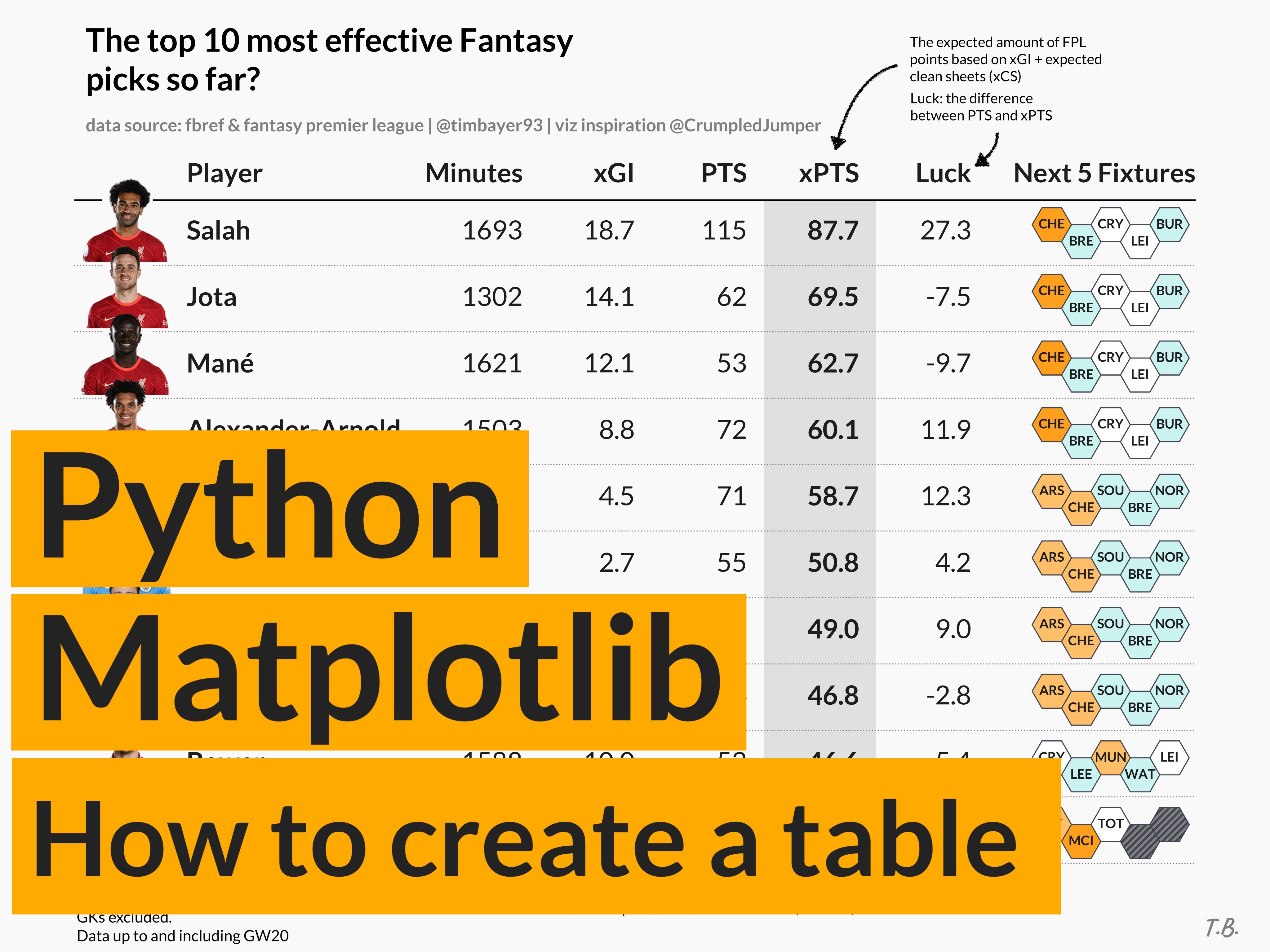 Introduction This tutorial will teach you how to create custom tables in Matplotlib, which are extremely flexible in terms of the design and layout. You’ll hopefully see that the code is very straightforward! In fact, the main methods we will be using are ax.text() and ax.plot().
I want to give a lot of credit to Todd Whitehead who has created these types of tables for various Basketball teams and players. His approach to tables is nothing short of fantastic due to the simplicity in design and how he manages to effectively communicate data to his audience.
Introduction This tutorial will teach you how to create custom tables in Matplotlib, which are extremely flexible in terms of the design and layout. You’ll hopefully see that the code is very straightforward! In fact, the main methods we will be using are ax.text() and ax.plot().
I want to give a lot of credit to Todd Whitehead who has created these types of tables for various Basketball teams and players. His approach to tables is nothing short of fantastic due to the simplicity in design and how he manages to effectively communicate data to his audience.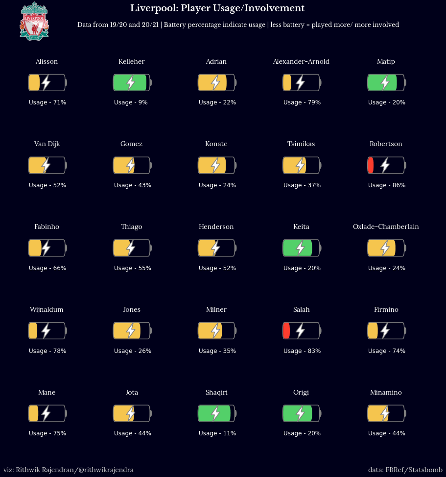 Introduction I have been creating common visualisations like scatter plots, bar charts, beeswarms etc. for a while and thought about doing something different. Since I’m an avid football fan, I thought of ideas to represent players’ usage or involvement over a period (a season, a couple of seasons). I have seen some cool visualisations like donuts which depict usage and I wanted to make something different and simple to understand. I thought about representing batteries as a form of player usage and it made a lot of sense.
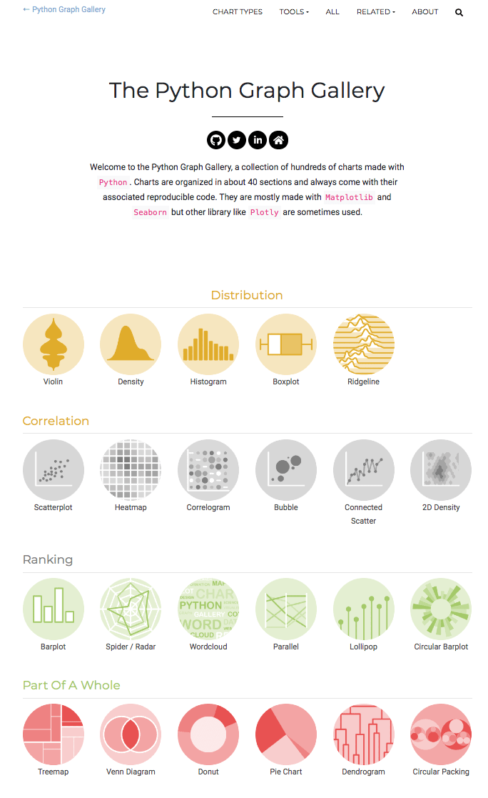 Data visualization is a key step in a data science pipeline. Python offers great possibilities when it comes to representing some data graphically, but it can be hard and time-consuming to create the appropriate chart.
The Python Graph Gallery is here to help. It displays many examples, always providing the reproducible code. It allows to build the desired chart in minutes.
About 400 charts in 40 sections The gallery currently provides more than 400 chart examples.
Data visualization is a key step in a data science pipeline. Python offers great possibilities when it comes to representing some data graphically, but it can be hard and time-consuming to create the appropriate chart.
The Python Graph Gallery is here to help. It displays many examples, always providing the reproducible code. It allows to build the desired chart in minutes.
About 400 charts in 40 sections The gallery currently provides more than 400 chart examples.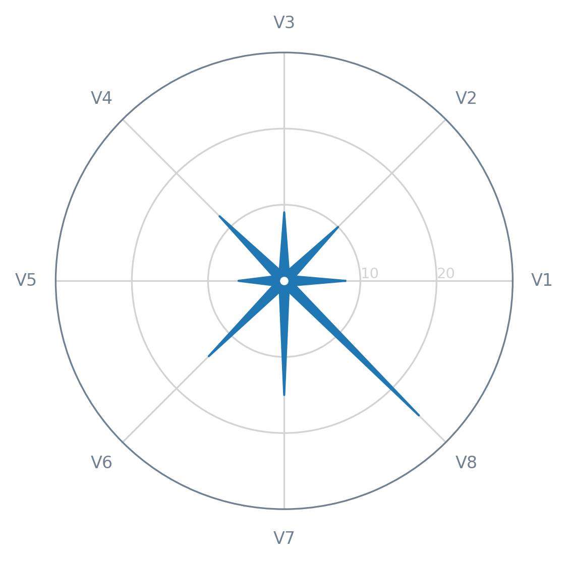 In May 2020, Alexandre Morin-Chassé published a blog post about the stellar chart. This type of chart is an (approximately) direct alternative to the radar chart (also known as web, spider, star, or cobweb chart) — you can read more about this chart here.
In this tutorial, we will see how we can create a quick-and-dirty stellar chart. First of all, let’s get the necessary modules/libraries, as well as prepare a dummy dataset (with just a single record).
In May 2020, Alexandre Morin-Chassé published a blog post about the stellar chart. This type of chart is an (approximately) direct alternative to the radar chart (also known as web, spider, star, or cobweb chart) — you can read more about this chart here.
In this tutorial, we will see how we can create a quick-and-dirty stellar chart. First of all, let’s get the necessary modules/libraries, as well as prepare a dummy dataset (with just a single record).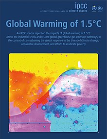 Background Cover of the IPCC SR15 The IPCC’s Special Report on Global Warming of 1.5°C (SR15), published in October 2018, presented the latest research on anthropogenic climate change. It was written in response to the 2015 UNFCCC’s “Paris Agreement” of
holding the increase in the global average temperature to well below 2 °C above pre-industrial levels and to pursue efforts to limit the temperature increase to 1.5 °C […]".
cf. Article 2.
Background Cover of the IPCC SR15 The IPCC’s Special Report on Global Warming of 1.5°C (SR15), published in October 2018, presented the latest research on anthropogenic climate change. It was written in response to the 2015 UNFCCC’s “Paris Agreement” of
holding the increase in the global average temperature to well below 2 °C above pre-industrial levels and to pursue efforts to limit the temperature increase to 1.5 °C […]".
cf. Article 2.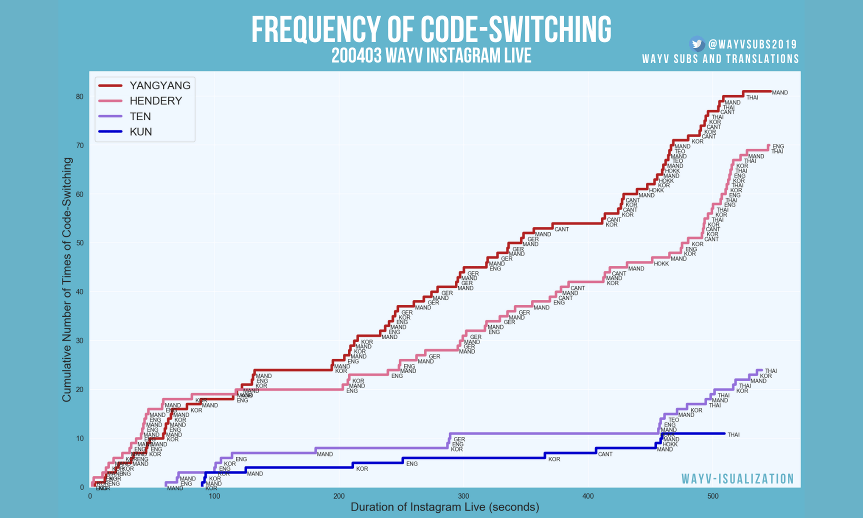 Introduction Code-switching is the practice of alternating between two or more languages in the context of a single conversation, either consciously or unconsciously. As someone who grew up bilingual and is currently learning other languages, I find code-switching a fascinating facet of communication from not only a purely linguistic perspective, but also a social one. In particular, I’ve personally found that code-switching often helps build a sense of community and familiarity in a group and that the unique ways in which speakers code-switch with each other greatly contribute to shaping group dynamics.
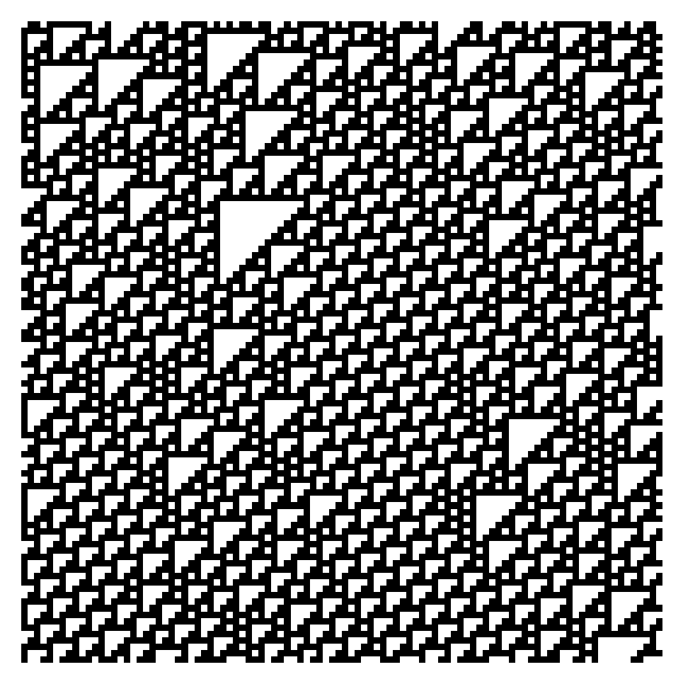 Cellular automata are discrete models, typically on a grid, which evolve in time. Each grid cell has a finite state, such as 0 or 1, which is updated based on a certain set of rules. A specific cell uses information of the surrounding cells, called it’s neighborhood, to determine what changes should be made. In general cellular automata can be defined in any number of dimensions. A famous two dimensional example is Conway’s Game of Life in which cells “live” and “die”, sometimes producing beautiful patterns.
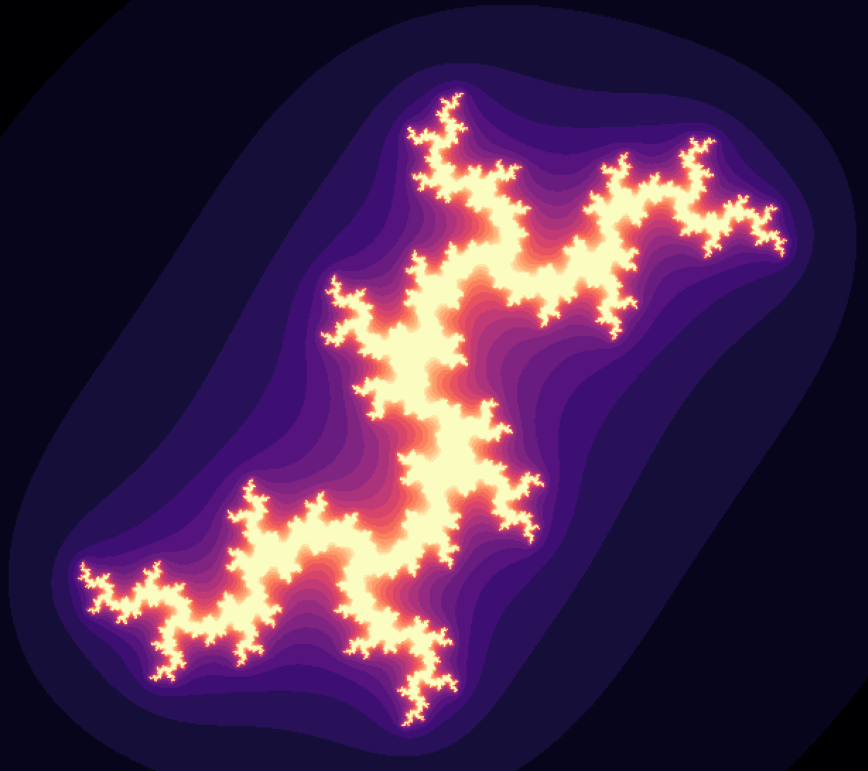 Imagine zooming an image over and over and never go out of finer details. It may sound bizarre but the mathematical concept of fractals opens the realm towards this intricating infinity. This strange geometry exhibits the same or similar patterns irrespectively of the scale. We can see one fractal example in the image above.
The fractals may seem difficult to understand due to their peculiarity, but that’s not the case. As Benoit Mandelbrot, one of the founding fathers of the fractal geometry said in his legendary TED Talk:
Imagine zooming an image over and over and never go out of finer details. It may sound bizarre but the mathematical concept of fractals opens the realm towards this intricating infinity. This strange geometry exhibits the same or similar patterns irrespectively of the scale. We can see one fractal example in the image above.
The fractals may seem difficult to understand due to their peculiarity, but that’s not the case. As Benoit Mandelbrot, one of the founding fathers of the fractal geometry said in his legendary TED Talk: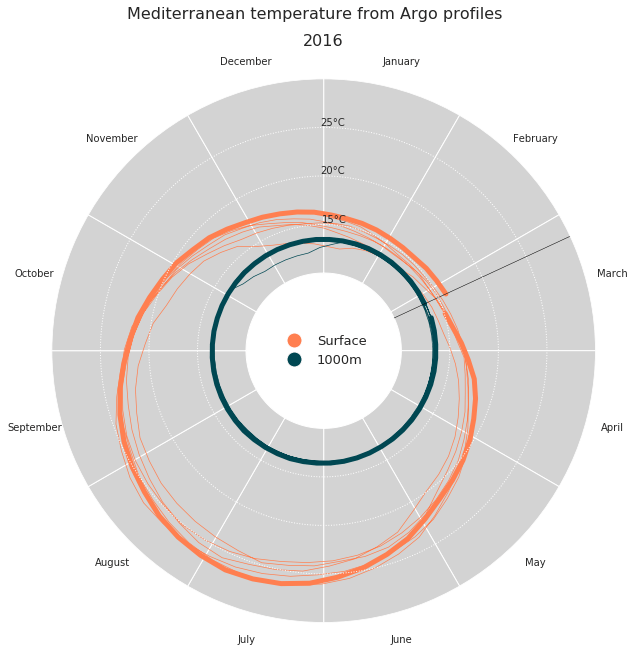 The ocean is a key component of the Earth climate system. It thus needs a continuous real-time monitoring to help scientists better understand its dynamic and predict its evolution. All around the world, oceanographers have managed to join their efforts and set up a Global Ocean Observing System among which Argo is a key component. Argo is a global network of nearly 4000 autonomous probes or floats measuring pressure, temperature and salinity from the surface to 2000m depth every 10 days.
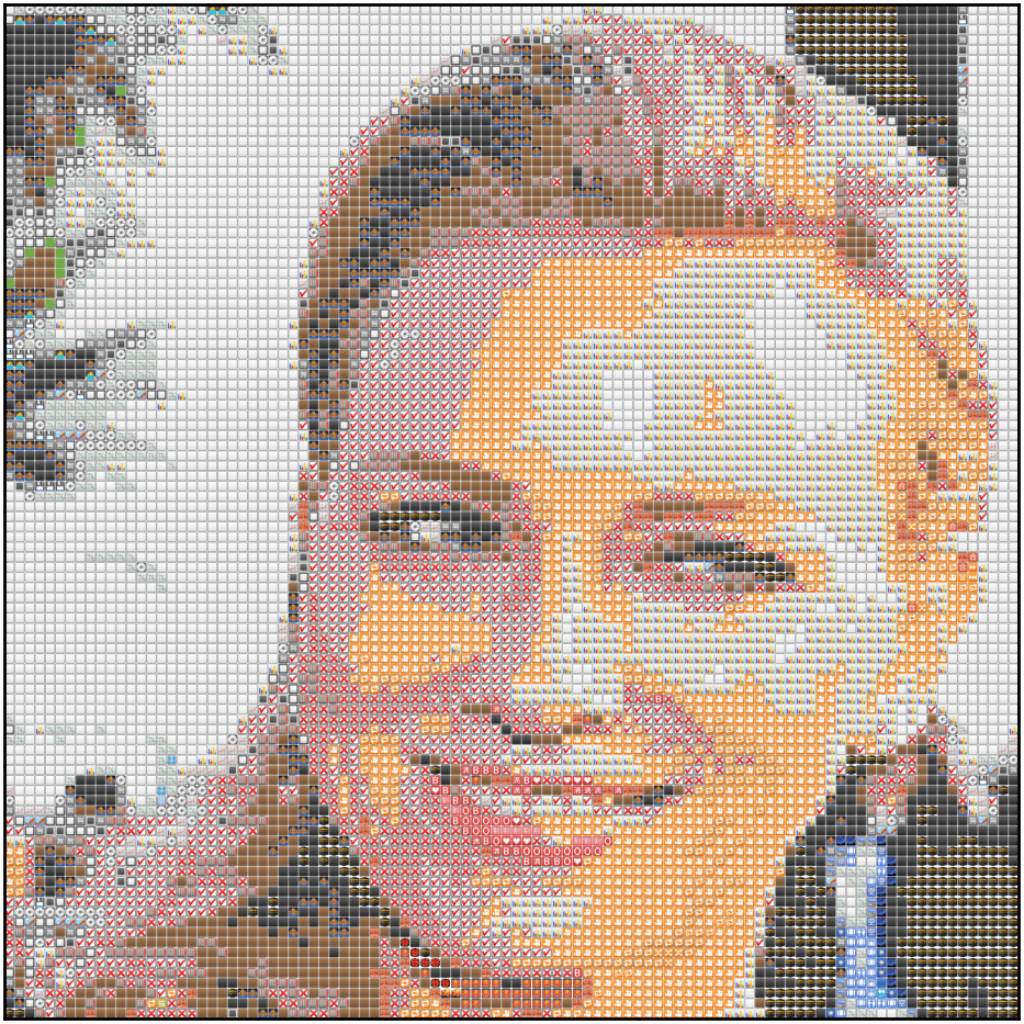 A while back, I came across this cool repository to create emoji-art from images. I wanted to use it to transform my mundane Facebook profile picture to something more snazzy. The only trouble? It was written in Rust.
So instead of going through the process of installing Rust, I decided to take the easy route and spin up some code to do the same in Python using matplotlib.
Because that’s what anyone sane would do, right?
A while back, I came across this cool repository to create emoji-art from images. I wanted to use it to transform my mundane Facebook profile picture to something more snazzy. The only trouble? It was written in Rust.
So instead of going through the process of installing Rust, I decided to take the easy route and spin up some code to do the same in Python using matplotlib.
Because that’s what anyone sane would do, right?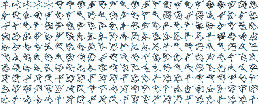 The other day I was homeschooling my kids, and they asked me: “Daddy, can you draw us all possible non-isomorphic graphs of 3 nodes”? Or maybe I asked them that? Either way, we happily drew all possible graphs of 3 nodes, but already for 4 nodes it got hard, and for 5 nodes - plain impossible!
So I thought: let me try to write a brute-force program to do it! I spent a few hours sketching some smart dynamic programming solution to generate these graphs, and went nowhere, as apparently the problem is quite hard.
The other day I was homeschooling my kids, and they asked me: “Daddy, can you draw us all possible non-isomorphic graphs of 3 nodes”? Or maybe I asked them that? Either way, we happily drew all possible graphs of 3 nodes, but already for 4 nodes it got hard, and for 5 nodes - plain impossible!
So I thought: let me try to write a brute-force program to do it! I spent a few hours sketching some smart dynamic programming solution to generate these graphs, and went nowhere, as apparently the problem is quite hard.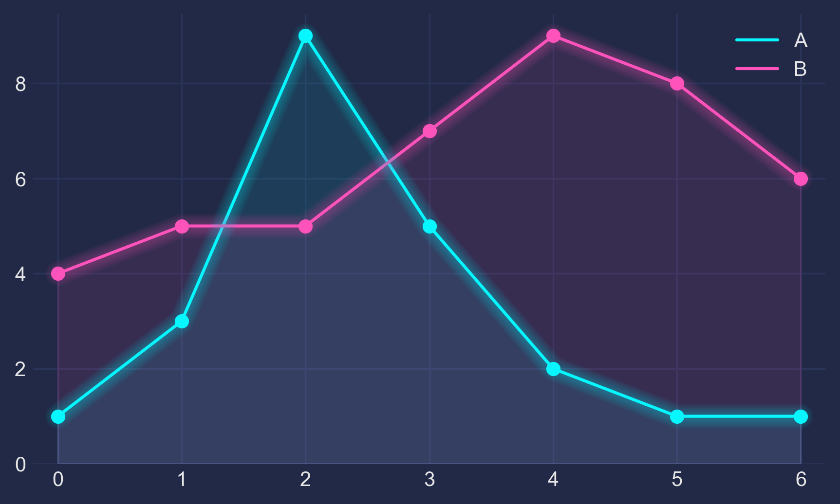 1 - The Basis Let’s make up some numbers, put them in a Pandas dataframe and plot them:
import pandas as pd import matplotlib.pyplot as plt df = pd.DataFrame({'A': [1, 3, 9, 5, 2, 1, 1], 'B': [4, 5, 5, 7, 9, 8, 6]}) df.plot(marker='o') plt.show() 2 - The Darkness Not bad, but somewhat ordinary. Let’s customize it by using Seaborn’s dark style, as well as changing background and font colors:
1 - The Basis Let’s make up some numbers, put them in a Pandas dataframe and plot them:
import pandas as pd import matplotlib.pyplot as plt df = pd.DataFrame({'A': [1, 3, 9, 5, 2, 1, 1], 'B': [4, 5, 5, 7, 9, 8, 6]}) df.plot(marker='o') plt.show() 2 - The Darkness Not bad, but somewhat ordinary. Let’s customize it by using Seaborn’s dark style, as well as changing background and font colors: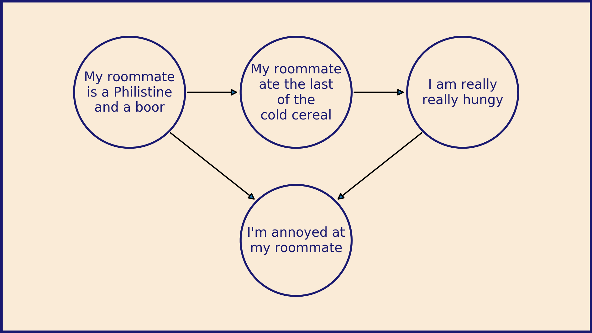 Matplotlib for diagrams This is my first post for the Matplotlib blog so I wanted to lead with an example of what I most love about it: How much control Matplotlib gives you. I like to use it as a programmable drawing tool that happens to be good at plotting data.
The default layout for Matplotlib works great for a lot of things, but sometimes you want to exert more control.
Matplotlib for diagrams This is my first post for the Matplotlib blog so I wanted to lead with an example of what I most love about it: How much control Matplotlib gives you. I like to use it as a programmable drawing tool that happens to be good at plotting data.
The default layout for Matplotlib works great for a lot of things, but sometimes you want to exert more control.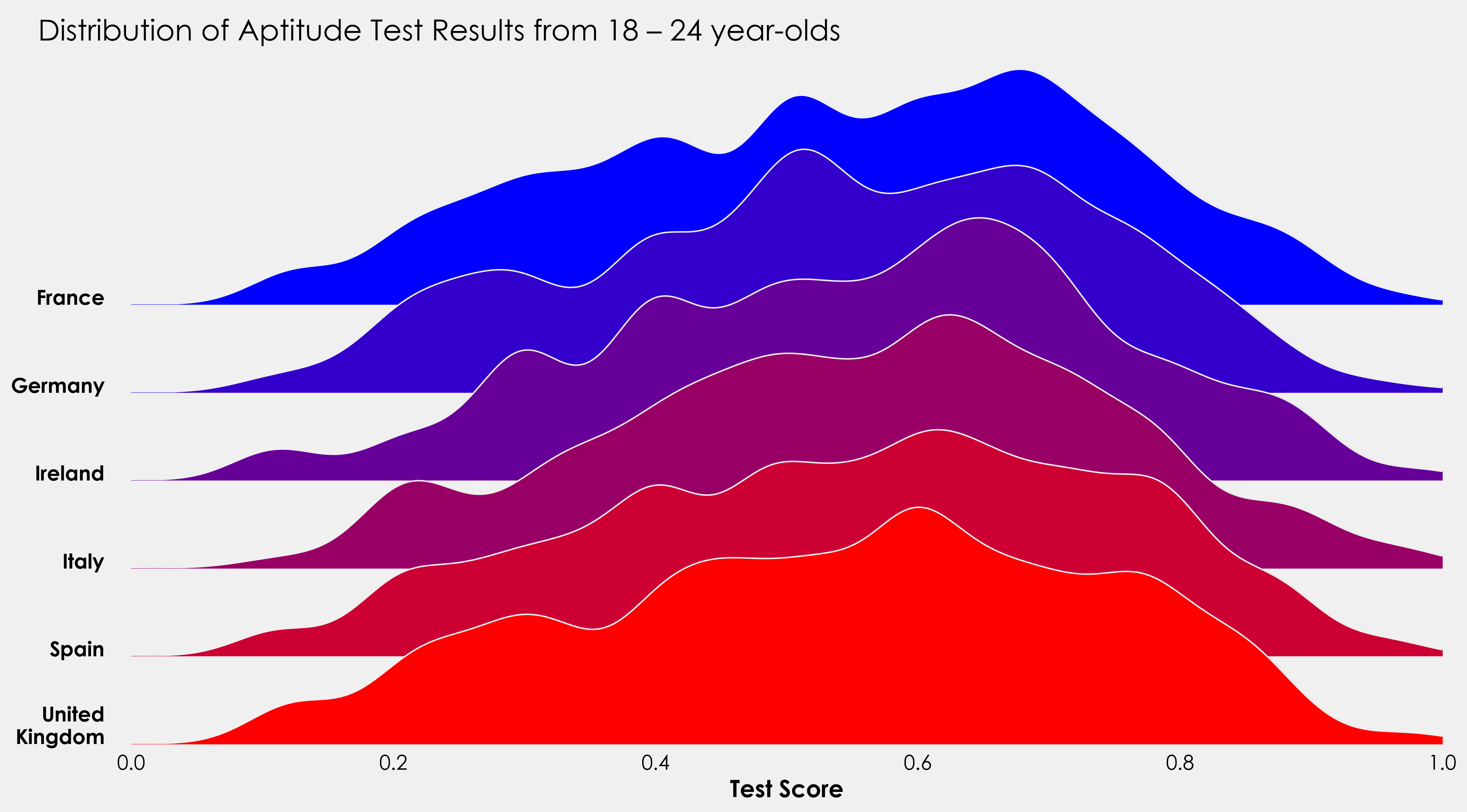 Introduction This post will outline how we can leverage gridspec to create ridgeplots in Matplotlib. While this is a relatively straightforward tutorial, some experience working with sklearn would be beneficial. Naturally it being a vast undertaking, this will not be an sklearn tutorial, those interested can read through the docs here. However, I will use its KernelDensity module from sklearn.neighbors.
Packages import pandas as pd import numpy as np from sklearn.
Introduction This post will outline how we can leverage gridspec to create ridgeplots in Matplotlib. While this is a relatively straightforward tutorial, some experience working with sklearn would be beneficial. Naturally it being a vast undertaking, this will not be an sklearn tutorial, those interested can read through the docs here. However, I will use its KernelDensity module from sklearn.neighbors.
Packages import pandas as pd import numpy as np from sklearn. My name is Ted Petrou, founder of Dunder Data, and in this tutorial you will learn how to create the new Tesla Cybertruck using Matplotlib. I was inspired by the image below which was originally created by Lynn Fisher (without Matplotlib).
Before going into detail, let’s jump to the results. Here is the completed recreation of the Tesla Cybertruck that drives off the screen.
Tutorial A tutorial now follows containing all the steps that creates a Tesla Cybertruck that drives.
My name is Ted Petrou, founder of Dunder Data, and in this tutorial you will learn how to create the new Tesla Cybertruck using Matplotlib. I was inspired by the image below which was originally created by Lynn Fisher (without Matplotlib).
Before going into detail, let’s jump to the results. Here is the completed recreation of the Tesla Cybertruck that drives off the screen.
Tutorial A tutorial now follows containing all the steps that creates a Tesla Cybertruck that drives. Preliminaries import numpy as np import matplotlib.pyplot as plt import matplotlib as mpl A Top-Down runnable Jupyter Notebook with the exact contents of this blog can be found here
An interactive version of this guide can be accessed on Google Colab
A word before we get started… Although a beginner can follow along with this guide, it is primarily meant for people who have at least a basic knowledge of how Matplotlib’s plotting functionality works.
Preliminaries import numpy as np import matplotlib.pyplot as plt import matplotlib as mpl A Top-Down runnable Jupyter Notebook with the exact contents of this blog can be found here
An interactive version of this guide can be accessed on Google Colab
A word before we get started… Although a beginner can follow along with this guide, it is primarily meant for people who have at least a basic knowledge of how Matplotlib’s plotting functionality works.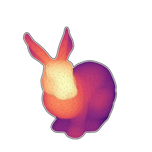 Matplotlib has a really nice 3D interface with many capabilities (and some limitations) that is quite popular among users. Yet, 3D is still considered to be some kind of black magic for some users (or maybe for the majority of users). I would thus like to explain in this post that 3D rendering is really easy once you’ve understood a few concepts. To demonstrate that, we’ll render the bunny above with 60 lines of Python and one Matplotlib call.
 Earth’s temperatures are rising and nothing shows this in a simpler, more approachable graphic than the “Warming Stripes”. Introduced by Prof. Ed Hawkins they show the temperatures either for the global average or for your region as colored bars from blue to red for the last 170 years, available at #ShowYourStripes.
The stripes have since become the logo of the Scientists for Future. Here is how you can recreate this yourself using Matplotlib.
Earth’s temperatures are rising and nothing shows this in a simpler, more approachable graphic than the “Warming Stripes”. Introduced by Prof. Ed Hawkins they show the temperatures either for the global average or for your region as colored bars from blue to red for the last 170 years, available at #ShowYourStripes.
The stripes have since become the logo of the Scientists for Future. Here is how you can recreate this yourself using Matplotlib.